Showing posts with label Color. Show all posts

Saturday, December 14, 2019

REYLO


Here's the Star Wars Greatest Moments Cover we did for Star Wars Doctor Aphra #40, out now from Marvel Comics!


Pencils


Rachel Dodson's Inks


Colors


TD


Thursday, May 10, 2018

Batgirl and the Birds of Prey 22 Cover Step by Step Part 1 Pencils

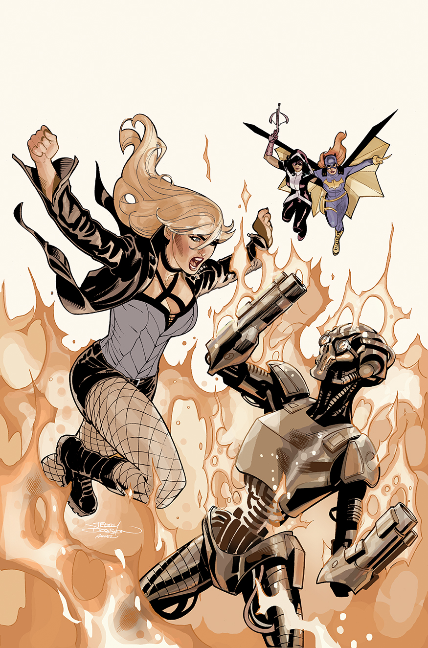
Here's a look at how we made the cover art for Batgirl and the Birds of Prey - 

out now from DC Comics.


PART 1

PENCILS


COVER SKETCH

The cover concept I sent into DC Comicsapproval. 

Roughs were drawn at 2" x 3" in my sketchbook using Warm Grey Copics then colored in Photoshop CS3.


INITIAL PENCILS

Drawn in Light Blue on 13" x 19" Bristol Board. 


I draw with Col Erase Light Blue Pencil and Staedtler HB Lead Pencil.


Getting closer


FINAL PENCILS


All ready for Rachel Dodson to ink...

Next time, 

INKS

in 

PART 2

TD

Wednesday, April 11, 2018

Batgirl and The Birds of Prey #21 Cover Art


The cover art by Rachel and me - out now from DC Comics


My Cover Sketches


My Pencils


Rachel's Inks


My almost completed colors.

TD

Saturday, December 9, 2017

Star Wars #38 Step by Step Part 3 Color

Our variant cover for Star Wars #38 - out now from Marvel Comics - a chance to draw Luke and Leia and X-Wings and Jedha!


Check out how we made it.

PART 3

COLOR

FLATS


The first stage of color is called flats - flatting allows me to choose an area to color at any point throughout the coloring process.

I try to adjust the colors to their medium value or imprimatura - I use this as the starting point for the piece. 


INITIAL COLOR (ROUGH IN)


I colored this on my Cintiq 22 HD using Photoshop CS3 .


I rough in quickly all the medium lights and darks on the figures and cast initial shadows.

Using the Pencil Tool (Hard Round pixel Brush) at 100% to to begin and then switch to lower 30-50% to get the right value of color for the next stages of rendering.

RIM LIGHT, GRADIENT, ROSY CHEEKS


On layers above the initial rough in -

LAYER 1 - Used the Gradient tool to fade out the background

LAYER 2 - I added Rosy cheeks to Leia and rounded out her face referencing photos from Empire 
Strikes Back

LAYER 3 - I added the yellow rim light to Luke using the Pencils tool at 100%

COLORING THE LINE ART


This is the icing on the cake step of the process.

I just started working on Luke here...


I colored a lot of the characters black lines, notice the lips, flesh outline and the rocks and clouds in the background.


Fun stuff!

ALMOST FINAL 


The colors I submitted to Marvel, editor Heather Antos had me light the background behind Luke...

FINAL COLOR 


Great suggestion, Heather!

PART 1


PART 2

LINE ART


TD

Wednesday, November 19, 2014

Death of Wolverine #1 Variant Cover Step by Step Part 2 COLOR

This is how we made the variant cover to Death of Wolverine #1 Cover art.

And so the colors…

I use  Photoshop CS3 and a Wacom Cintiq 13HD to color with.


Initial rough in 
of the colors - getting the midtone values/colors of the characters in and the Gradient Tool for the Background

Just using a big pencil and a little lasso and gradient to move to the next layer of color.


As I get closer to getting the coloring where I want it - I begin converting the lineart to color lines.


Final touches include more texture into the Background face.


Detail of Jubilee


Detail of Storm, Wolverine and Jean Grey


Print version

You can find this comic at your local comic book retailer


And digitally at 

https://www.comixology.com/Death-of-Wolverine-1-of-4/digital-comic/135396?ref=c2VyaWVzL3ZpZXcvZGVza3RvcC9saXN0L0lzc3Vlcw

TD

Saturday, June 7, 2014

CATWOMAN #31 Cover - Step by Step PART 3 COLOR

Here's a look of how the cover to Catwoman 31 was made…

the colors...


The first stage of coloring is to have the art "flatted".

Flatting allows me to choose an area to color at any point throughout the coloring process - which is really helpful when you've almost finished coloring the art and realize red and blue of Mirror Master should really be orange and green - see below :-)

At this stage I go and adjust the colors to their medium value or imprimatura - I use this as the starting point.


My initial rough in of the colors, done in Photoshop CS3 with a Wacom Intuos Graphics Tablet. I add darker values first and then the lighter values.


This one moved along pretty quickly … I add the cast shadow of Catwoman - two reasons - it should be there and it really helps frame the action and composition!

I also begin turning the lineart in to colored lineart...


After I turn in the initial colors - it occured to me to add more mirror elements to pay off/clarify the mirror idea and to complete the composition.


Finally, I blur/brighten the reflection to give a little more reality to the reflection without just simply making the black lines grey or blue.


How it turned out in print!

Cover is out in stores now...

You can find this comic at your local comic book retailer


And digitally at Comixology 


Enjoy!

TD


Tuesday, April 22, 2014

X-MEN #13 Cover - Making of PART THREE - Color

 Here's a look behind how the cover of X-Men #13 was created (out in stores this week from Marvel Comics - written by Brian Wood with art by Clay Mann).


The first stage of coloring is to have the art "flatted".
Flatting allows the colorist to choose an area to color at any point throughout the coloring process.


My initial rough in of the colors, done in Photoshop CS3 with a Wacom Intuos Graphics Tablet. 


This is pretty simple piece so in no time I moved to finishing details, such as turning all the black lineart of the fleshes and yellows to color lineart. I added more texture and color to the background. 


Just a bit more polishing - note Jubilee's left forearm, her glasses, and her and Shogo's faces.


And the comic in print.


You can find this comic at your local comic book retailer


And digitally at 


TD