Here's how we made the Box Art for Count Chocula cereal - out in stores now ;-)
I worked with Alex Antone at DC Entertainment in conjuction with General Mills to do this assignment and what an assignment it was, drawing something from my childhood!
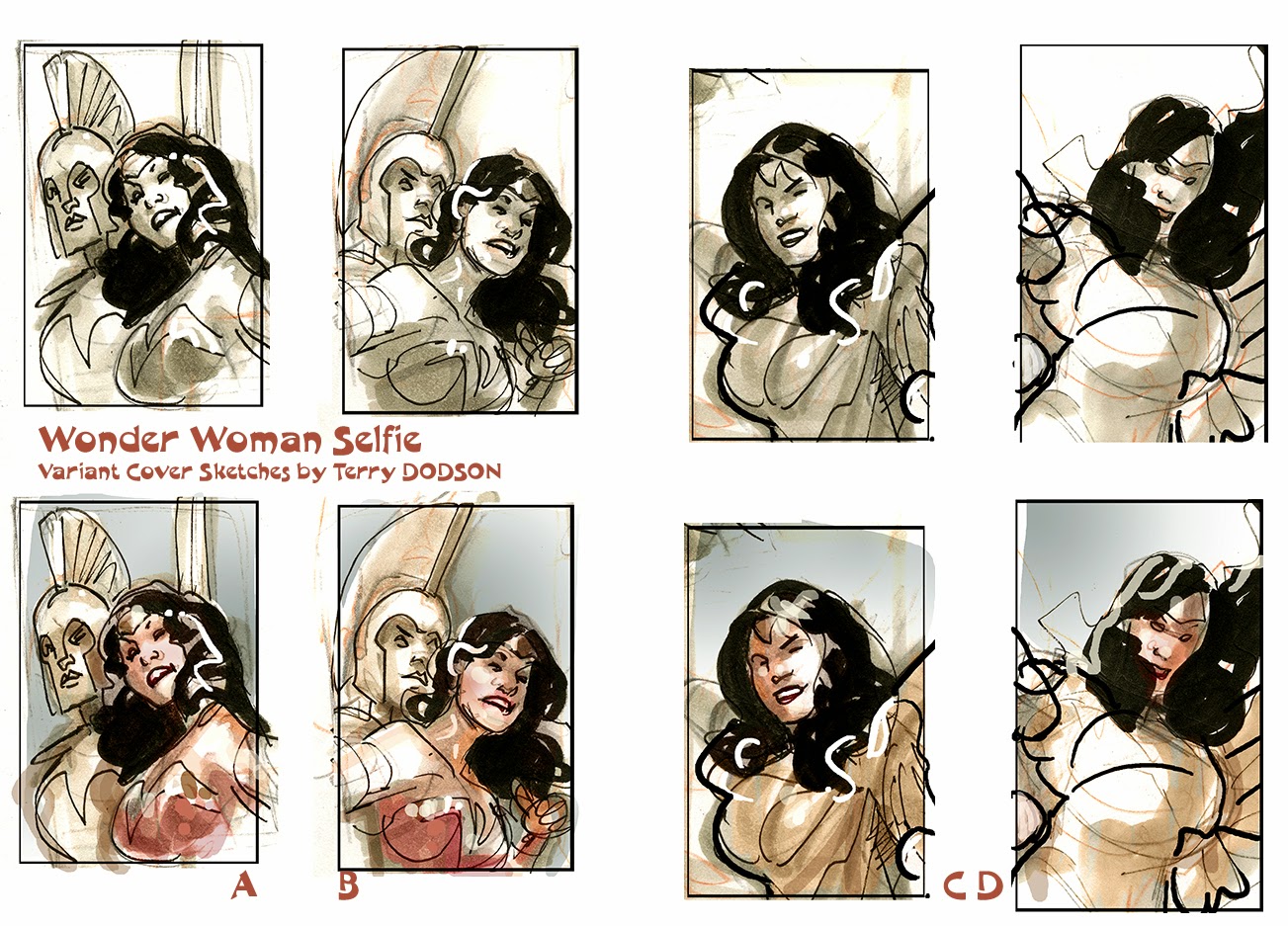
The sketches are drawn at 2x3 inches in my sketchbook in pencil and pen and then cleaned up and colored in Photoshop.
Sketch D was chosen.

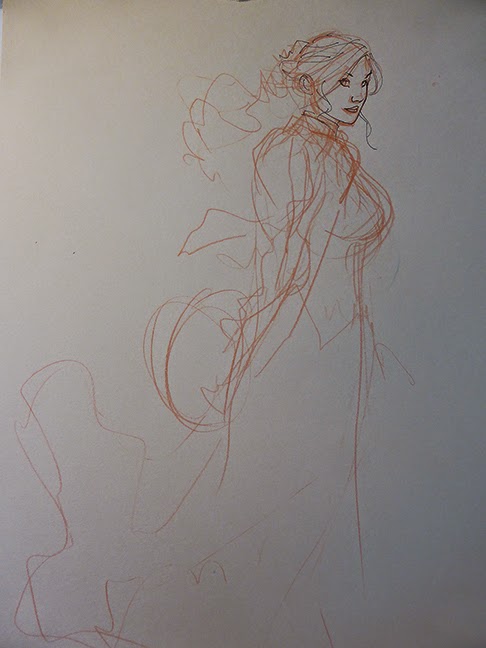
The rough used to figure out the proportions and lettering done in Photoshop.

I drew the art on two layers so that the background could be placed where best suited.
Pencils drawn in Light Blue and HB lead on 12 x 18 Bristol Board.

There have been a variety of Count Chocula's throughout the years and I made my own version picking out my favorite bits.
Pencils drawn in Light Blue and HB lead on 12 x 18 Bristol Board.

Here's how the pencil art looked combined (in Photoshop).

Rachel Dodson's inks of the background.
This ended up being the background used on the Booberry and Frankenberry Box Art as well.

Rachel's inks on Count Chocula.
Rachel uses Windsor Newton Series 7 Kolinsky Sable #2 Brush and Higgins Black Magic Ink to ink with.

Combined in Photoshop for reference.

Colors by Dave McCaig

And the final product… mmmmm!
TD