Thursday, November 21, 2013

X-Men #7 Cover Step by Step Creation

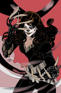
Here's how I created the cover to X-Men #7, now in stores from Marvel Comics. Written by Brian Wood, Inks by Rachel Dodson, Colors by Jason Keith and interiors by me!


First thing was to come up with a cover sketch - and character design simultaneously! This is the very first appearance of the Lady Deathstrike. Brian Woods gave me some suggestions and I ran with it.

These sketches were submitted to Editor Jeanine Schaefer.

 They were
drawn at 2x3 inches in my sketchbook in pencil and pen and then cleaned up and colored in Photoshop.


Jeanine asked that I go with a more close up version and these are what I came up with.

It was decided to go with "H".


 I began penciling the cover  with light blue and HB lead on 12 x 18" Bristol Board. This is interesting as I'm still designing the look of the character as I'm drawing this - welcome to the world of mainstream comics :-)


Using tracing paper, I nailed down the claws and hair as those of the biggest most foreground"est" elements.


After nailing those down, got the face figured out.


Nailing down hairstyle.


Finalizing costume details and working on background.


Final pencils.


Rachel Dodson inks over my pencils. Rachel uses a Windsor Newton Series 7 Kolinsky Sable #2 Brush and Higgins Black Magic ink to ink the covers with.


FLATS

The first stage of coloring is to have the art "flatted".
Flatting allows the colorist to choose an area to color at any point throughout the coloring process.


Getting the colors more how I want them. I use Photoshop CS3 with a Wacom Intuos Graphics Tablet.


Started initial color rough in.


Started working more on the background.


Coloring done.


Corrections and details.

I added some more "gold" detail to the costume.

And at this point I turn black lineart into colors and add special effects (SFX).


The printed comic.

TD


Wednesday, November 20, 2013

X-Men #7 Original Art

X-Men #7 ships from Marvel Comics today


X-Men #7 original cover art


X-Men #7 Page 2


X-Men #7 Page 3


X-Men #7 Page 4


X-Men #7 Page 5


X-Men #7 Page 10


 X-Men #7 Page 16


Here's the price list for the original art to X-Men #7. 
Original art is black and white and on 11 x 17 Strathmore Bristol Board.
 If you are interested in a page, you can email 
 terry at terrydodsonart dot com to check for availability.

Page Price$
1 $100.00
         2  $300.00
         3  $280.00
         4  $280.00
          5 $500.00
         6  $300.00
         7  $200.00
         8  $280.00
         9  $250.00
           10 $500.00
        11 $350.00
        12 $280.00
        13 $300.00
        14 $300.00
          15 $300.00
        16 $700.00
        17 $500.00
        18 $240.00
        19 $350.00
           20 $400.00


Friday, November 15, 2013

Ghost #1 Step by Step PART THREE Color

Here's the final step of creating the cover to Ghost #1, out this month from Dark Horse. Written by Kelly Sue DeConnick and Christopher Sebela and art by Ryan Sook.


Here we go!


The first stage of coloring is to have the art "flatted".
Flatting allows the colorist to choose an area to color at any point throughout the coloring process.


  My initial rough in of the colors, done in Photoshop CS3 with a Wacom Intuos Graphics Tablet.

I had the idea of an orange sky in my head the whole time


However, I couldn't get the right orange so I switched to a green sky.


Now that I'm happy with green background I began changing the rest of the orange elements to green.


Pushing the lighter areas of the figure and foreground.

Using a custom brush tool, I began adding texture to buildings.


Pushing the lights and darks to help separate Ghost and the FG building from the BG.


Began turning the black lineart into color on the figure.


Turning the BG lineart into color lines - really helps separate.


Fine tuning.


And finally added some clouds and lights to the sky for the 

Final colors…

TD


Friday, November 8, 2013

Ghost #1 Cover Step by Step PART TWO Pencils to Ink

Here's the next step of creating the cover to Ghost #1, out this month from Dark Horse. Written by Kelly Sue DeConnick and Christopher Sebela and art by Ryan Sook,

After I turned in the pencils seen in PART ONE I received feedback from Dark Horse to make some minor changes to Ghost's costume so I used it as an opportunity to change a couple of things that bothered me in the original pencils.

 I started on a new piece of paper with a blue line printout of the original pencils on it. I used light blue and HB lead on 13" x 19" Bristol Board.


I wanted to give the pose a little more dynamism and movement - so I had Ghost's right foot coming "atcha"!


And this is what I gave to Rachel Dodson to work on because…

Rachel had started working on the original pencils.


Rachel uses Windsor Newton Series 7 Kolinsky Sable #2 Brush and Higgins Black Magic ink to ink the covers with.


This is Rachel's inks over my original pencils.


This is the ink's over the 2nd pencils.


And the magic of Photoshop where I combined the images together.

Onto the color…

TD


Wednesday, November 6, 2013

Ghost #1 Cover Step by Step PART ONE

Here's how I created the cover to Ghost #1, out this month from Dark Horse. Written by Kelly Sue DeConnick and Christopher Sebela and art by Ryan Sook!


First thing was to come up with a cover sketch. These are sketches I submitted to Editor Patrick Thorpe at Dark Horse - drawn at 2x3 inches in my sketchbook in pencil and pen and then cleaned up and colored in Photoshop.

 Next I worked on the costume and look of Ghost in order to figure out how I was going to draw her. I actually drew an issue of the original 90's series when I didn't have a clue what I was doing so this was a great opportunity to revisit the character.


Figuring out the hood and cape.


Figuring the body structure and hood/scarf.


How the costume works underneath.


I went back and forth with Patrick (and Dark Horse and Mike Richardson) and Ryan with these sketches to get their feedback and suggestions, especially Ryan's as it's his book.

 Once we were all cool, I started penciling the cover  with light blue and HB lead on 13 x19 " Bristol Board.


The finished pencils - or so I thought!

More to come!

TD