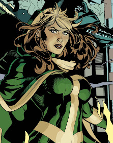
 This cover was colored very quickly so try not to do what I did - I simply colored what needed to be colored for most impact and will touch up later.
First thing I did was to set up a medium value on all the colors ( an imprimatura in painting speak). This sets up a nice base value in which I-
Then put in initial lights and darks on Rogue as she is the main feature of the cover - even in the sketch.
I color mostly with the Pencil tool on normal at 100% as it has a hard edge so it can be reselected later - especially at this stage. I'm worried about getting the values and colors correct not worrying about edges/blends. This is how I was taught to paint and so I use the same approach in PS.
TD
Thank you for the explanation on your prelim coloring. If I could, may I ask a couple of questions?
ReplyDeleteWhen you build up your darks and lights, I see you start fairly low-key. When you build up closer to the highlight, how do you add color from the light source (in this case, yellow/orange fire) to the lights of Rogue's suit. Do change the opacity, layer property (screen, hard light, etc.), or mix it like a traditional painter?
Also, I have difficulty picking skin tones when a character is in an unusual lighting/high contrast situation b/c of its semi-transluscent nature. Often, instead of a natural appearance, my coloring comes across as post-impressionistic, my subject skintone too bright/orange-ish or muddy. That would be fine if that were my intention, but usually it isn't. Do you have an tips for those of us that struggle with this? Or, for that matter, color in general?
I don't know if I articulated that very well, but...
Again, thanks for the blog posts and the "behind that scenes" sequentials. I appreciate it.
Micah